The first time Steve Jobs demonstrated iPhone scrolling in 2007, the audience let out a collective “wow”.
The device’s astonishing fidelity was enabled by a new technology Jobs called multi-touch. It wasn’t the first touch-screen tech, but it set a new bar for precision and accuracy. The natural scrolling and pinch-to-zoom gestures alone instantly differentiated the interface from every other computer in the market.
“And boy have we patented it!”
Of course, Apple didn’t stop there. Tech enthusiasts are familiar with the Cupertino company’s ‘tick-tock’ iPhone update pattern, which was more apparent back when new numbers represented a major update and the ‘S’ model was a refinement, like iPhone 5 & 5S etc.
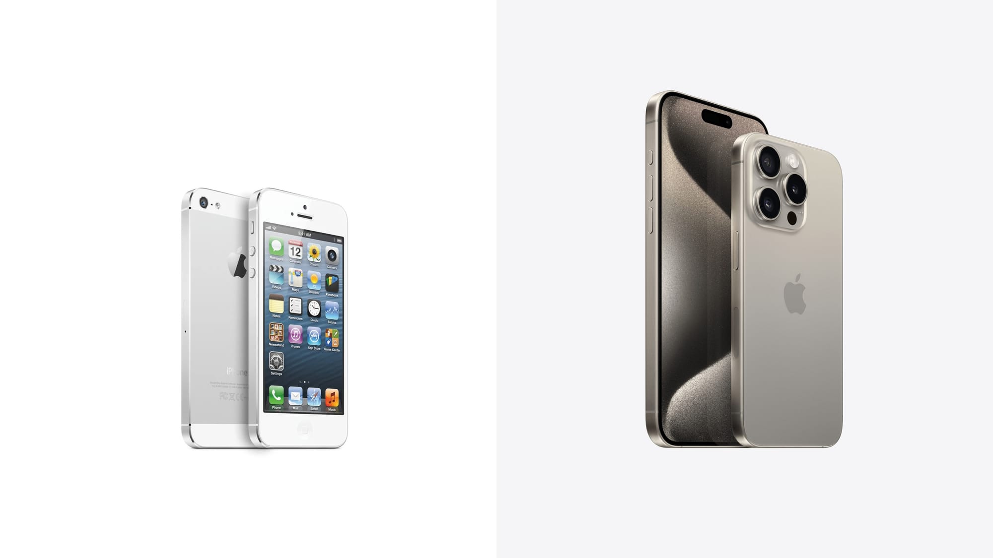
This year’s iPhone models might look pretty similar to last year’s. But (now that the charging port is USB-C) the only major physical traits that remain unchanged between 2012’s iPhone 5 and 2023’s iPhone 15 Pro are the silhouette and the Apple logo.

Besides the obvious increase in overall size, the most significant difference between these two devices is how much bigger the screens have become; something which was only made possible by drastically shrinking the bezels and removing the famous home button.
Even if you have an Android phone, you’re probably still familiar with the button’s omnipresent replacement — the thin bar at the bottom of the screen called the home indicator.
iPhone users interact with this interface dozens of times every day. But when was the last time you stopped to think about how it actually feels to use a modern iPhone?
Everything fluidly responds to the speed and direction of your movements. When you swipe up to go home, apps follow the inertia of your gesture as they fling back towards their icons. Opening the multitasking view requires a slower and more deliberate swipe that evokes sliding a credit card out of your wallet. It all feels tangible.
This gestural interface — which has been utilized by every flagship iPhone sold since 2017 — was designed by Chan Karunamuni and Apple’s human interface design team.
The project i’ve been working on the past 1.5 years is finally here. Try out the all new fluid gestural interface on the iPhone X. pic.twitter.com/jlOI5m1ycS
— Chan Karunamuni (@chan_k) November 3, 2017
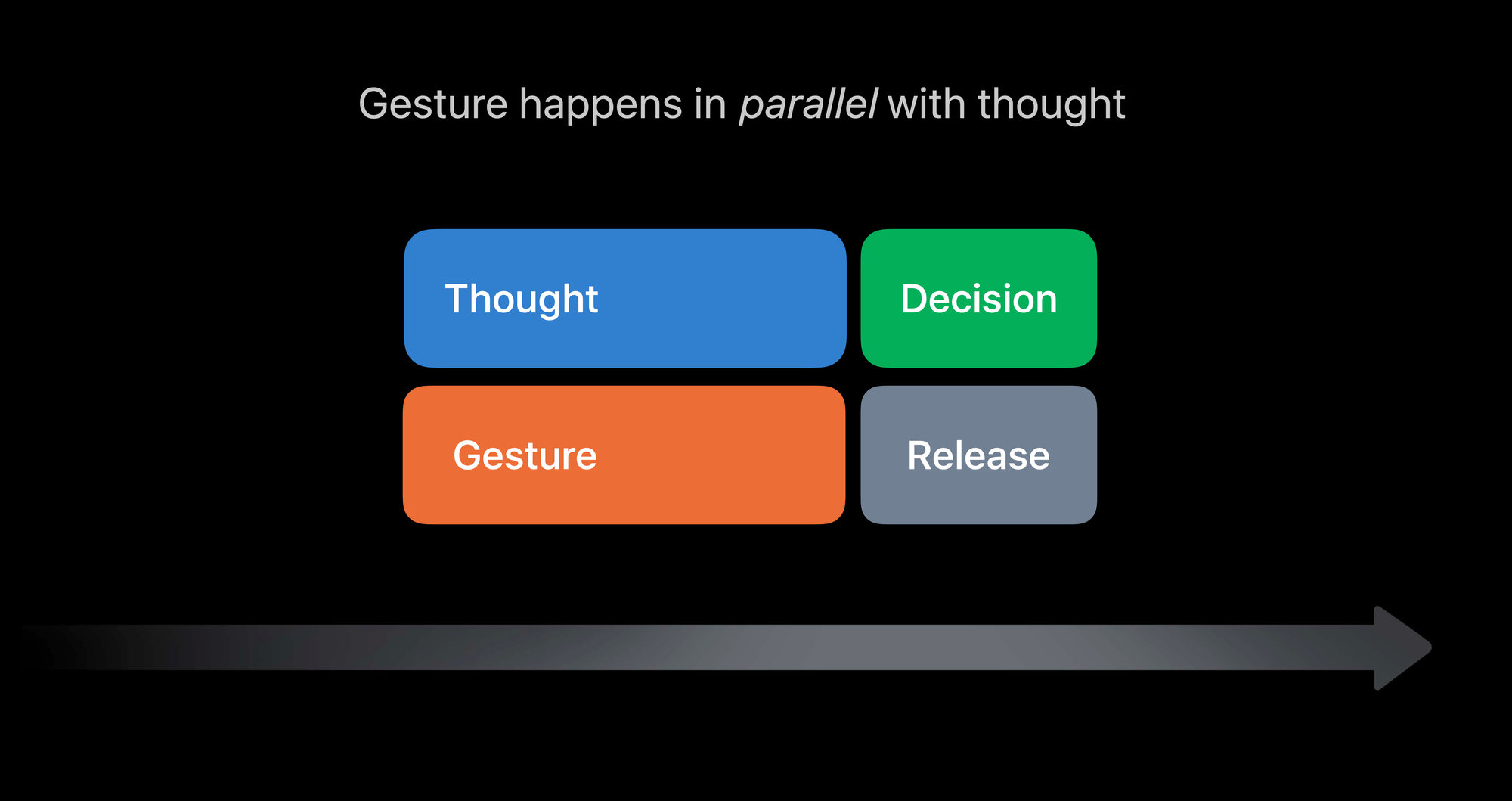
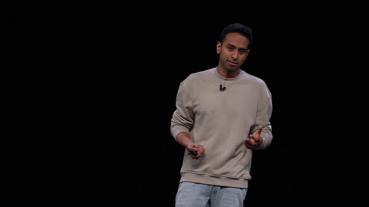
In a fascinating presentation at WWDC 2018, Karunamuni (plus Nathan de Vries & Marcos Alonso, who also work on Apple’s human interface design team) described their principle of working “with behavior rather than animation”.

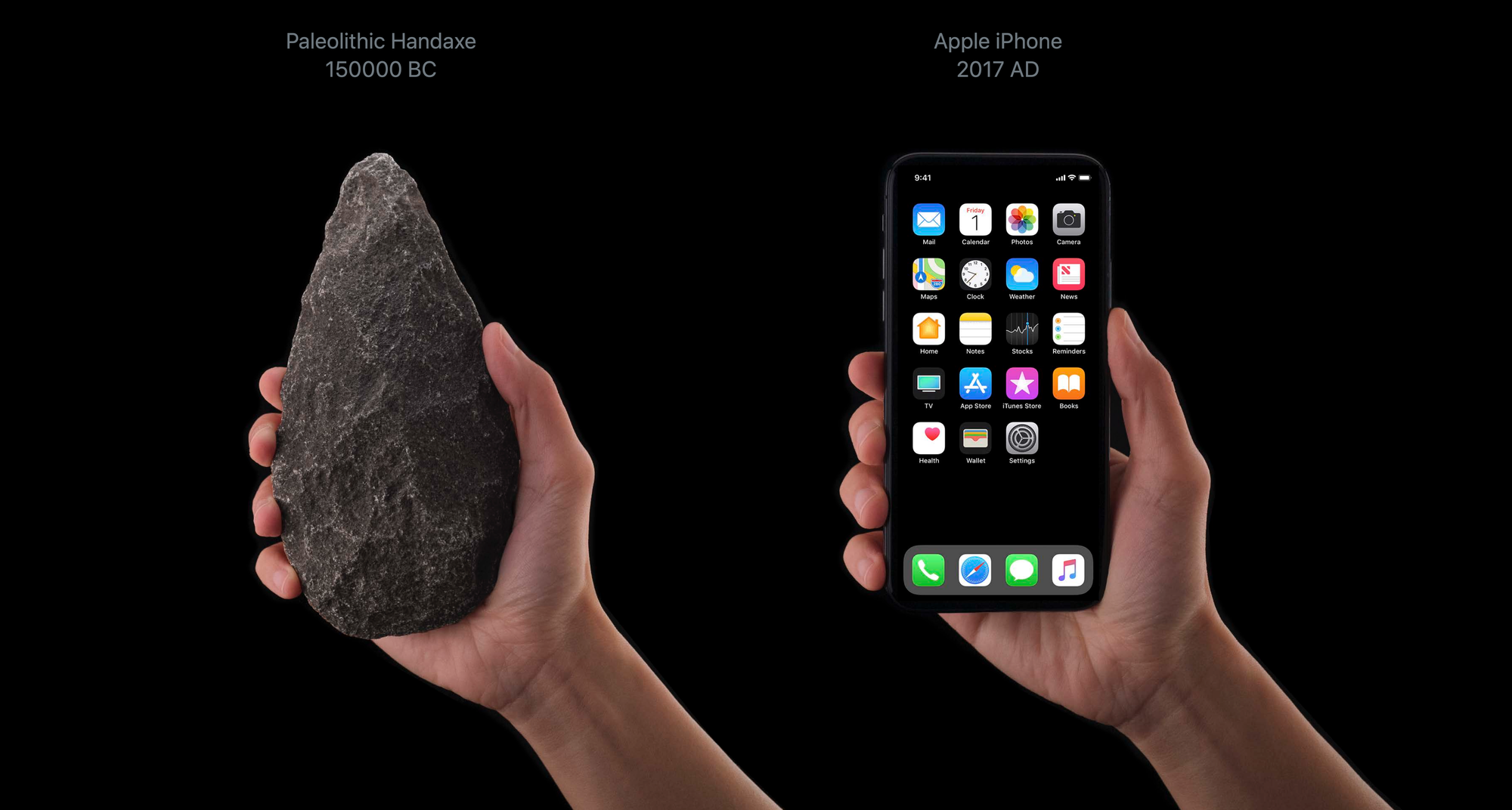
It’s a very similar energy to what Steve Jobs was getting at with multi-touch on the original iPhone. The software should feel like it’s working with you, not against you: a bicycle for the mind.
Using modern iPhones feels different from using other computers in a way that’s difficult to describe. As Chan pointed out in his presentation, it’s one of those “you know it when you see it” type of things.

The entire talk is worth watching; it describes the unique techniques that Apple has cultivated for creating these types of fluid interfaces, like eliminating latency so the device instantly responds to our actions.
Today’s iPhones are incredibly fast, responsible, and dynamic. We take for granted how consistent and reliable they are, and only really notice them when something breaks or glitches out. But it’s worth slowing down every now and then to appreciate just how incredible our tools have become.

These techniques provided the foundation for Karunamuni’s recent work creating the Dynamic Island — a unique blend of hardware and software that was the headline feature of 2022’s iPhone 14 Pro.
The new project I designed arrives today - the Dynamic Island.
— Chan Karunamuni (@chan_k) September 16, 2022
Its goal is to feel like a living, elastic bubble that can fluidly shape shift into different alerts and experiences.
This is just the start, but I’m excited to see it begin its life! pic.twitter.com/HTkhSK69LU
It’s the kind of innovation that could only be created inside Apple.
The Dynamic Island is innovative because it takes a perceived weakness — the fact that the front camera, FaceID, and other sensors still require a section of the screen to be cut out and theoretically rendered unusable — and converts it into a strength.
Suddenly the unusable space is a useful feature.
A few Dynamic Island moments we added recently this year. pic.twitter.com/8ZXBLq9uNy
— Chan Karunamuni (@chan_k) December 21, 2023
This kind of quick access to information is as interesting in theory as it is useful in practice.
In typical Apple fashion, they were’t the first company to maximize their display real-estate with a hole-punch camera lens — but it says a lot that there are multiple apps which imitate the feature for Android phones.
I did a short WWDC presentation where I share some of the thinking behind the design of the Dynamic Island, as well as a bunch of examples and pointers on how to design for it.
— Chan Karunamuni (@chan_k) June 8, 2023
Check it out in the second half of this talk: https://t.co/c1g0Txeoz4 pic.twitter.com/hUZpPDQqh2
When Apple finally removed the home button in exchange for the gestural interface, Android users were quick to point out that tons of Android phones had software home buttons for years. The real ones will remember that the oft-forgotten but highly innovative Palm Pre actually introduced many of these ideas back in 2009 — but ideas are worthless without execution.
Chan Karunamuni’s work on the Dynamic Island continues a long line of brilliant ideas, masterfully executed by Apple.
Nuggets
I contributed this little shockwave moment to the new AirDrop and NameDrop nearby sharing features in iOS 17. Give it a try! pic.twitter.com/J4tsoJYqzt
— Chan Karunamuni (@chan_k) September 18, 2023
Watch me talk about designing the fluid gestural interface of iPhone X at WWDC18. Also featuring fantastic talks about sculpting dynamic motion with @atnan and designing elegant gestures with @malonso. Hope you enjoy it!
— Chan Karunamuni (@chan_k) June 7, 2018
Full video: https://t.co/izVErp8R68 pic.twitter.com/MKdbgowPlO
"The Dynamic Island feels not merely like a shape or dedicated area at the top of the screen, but like a real thing with personality. I have genuine affection for it already."
— Chan Karunamuni (@chan_k) September 17, 2022
So proud of this feature we worked on getting a really positive response.https://t.co/XGkBjUNa60
This is some extremely slick conceptual design - integrating hardware and software perfectly - that has been implemented shockingly well. Truly Apple-only stuff. I love this. pic.twitter.com/1NTeHleo1P
— Sebastiaan de With (@sdw) September 7, 2022
To Tim: The Button on the IPhone was FAR better than the Swipe!
— Donald J. Trump (@realDonaldTrump) October 25, 2019


