Typography is invisible until you notice it — then you start to see it everywhere.
Typetura takes an entirely new approach to typesetting text on the internet.
- Traditional websites have a limited number of “breakpoints” where the text changes sizes to fit a display. But any window in-between the predetermined sizes doesn’t adjust to fill extra space, creating a sense of tension which you probably don't notice, but you definitely feel.
- The way around this is to create a bunch of different styles which can respond to different sizes... which becomes increasingly complicated.
- Typetura is different: it automatically adjusts the size of text on your website to fit in the window it lives in through a method called intrinsic typesetting.
It might seem like an inconsequential difference, but when you’re reading, these things really matter. Over time, even the smallest details stack up.
“Your brain doesn’t know it, but your heart can tell.”
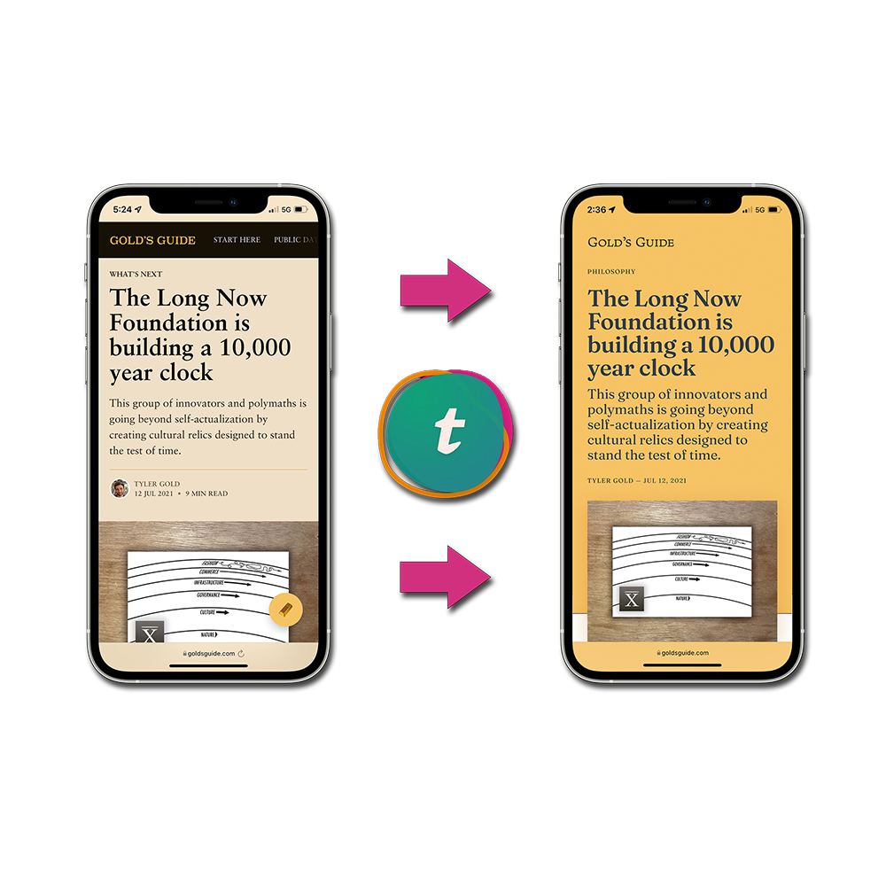
So I was stoked when my friend Scott Kellum, the founder and CEO of Typetura, reached out about updating the theme for Gold’s Guide to utilize intrinsic type.
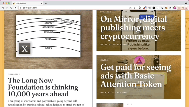
Now, all the text on goldsguide.com is rendered using Typetura and wrapped in a beautiful new theme Scott very patiently helped build.
The entire website feels more solid, like there’s a dimensionality to it. I love it.
Along the way, I’ve learned a ton of new things about typography, typesetting, typefaces, fonts, and the intricate differences between all of those things. What Scott has built with Typetura is as intricate as it is impressive.
After hanging out with Scott on video chats for the last few weeks, I’ve come to realize that typography is about more than just text — it’s also about how we understand information.
Typetura is what’s next for typesetting on the internet
Typetura isn’t just technically impressive, it’s basically unprecedented. Scott has taken something clunky, tedious, and complicated and created a specialized tool which automates the entire process.
Here’s how it works.
Websites are essentially a bunch of containers, like boxes which hold the different elements which make up the overall web-page. Those boxes usually contain other boxes, which each can have their own styles (size, margins, color, etc.) to make each element look exactly as the website’s designer intends.
This gets complicated when you start to consider all the different screen and window sizes across devices. Smartphones, tablets, laptops, desktops — all of these gadgets have differently-sized displays, each of which require a dedicated version of the website to fit properly.
If designers want to optimize their website for multiple device sizes, they have to manually create a bunch of different styles for each element to fit better in different window size.

For example, in order to create a heading, h1-mobile, h1-tablet, h1-desktop, could all be used to represent the same large heading, only sized differently for each display size. After all — you want to have the desktop version take up more space than on a tablet, which has more room to work with than a smartphone.
Typetura does things differently. Instead of having to create all these different styles to render the text for different versions of your site, Typetura uses intrinsic typesetting to read the size of the window the text is being displayed in and then automatically size text proportionately.
Try it out on desktop by clicking the button below, then dragging the sliders and S-curve and see how the text adjusts proportionally.
If you change the size of your browser window after tweaking those settings, you’ll notice that everything stays in proportion — this is Typetura’s magic.
Intrinsic type makes designing the overall website theme a matter of designing the boxes for the text and then... and that’s really it. There’s no need to create custom classes to define the size of headlines or body text at each breakpoint.
Instead, Typetura just does its thing, automatically typesetting text to fit the container it lives in, generating beautiful text at every display size.
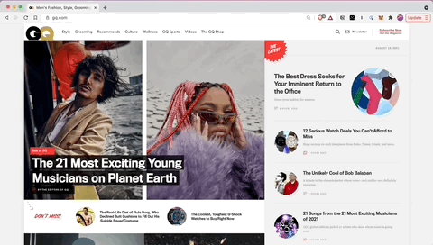
Not to brag, but... Gold’s Guide now has better typesetting than Monocle, GQ, and even the New York Times.
Typetura does this by exposing the text to its surroundings, which enables the styles to adjust and adapt dynamically. This how it’s able to proportionally size the fonts; Typetura is always paying attention to the size of the container for each bit of text, and adjusting the size for each character to best fit. It does all of this while simplifying your code, freeing you up to think about creating the best layouts instead of the details of typesetting.
Scott explains the technical details in this article on CSS-Tricks:
Instead of writing explicit text styles, you define how those styles change in proportion to the text’s area. This enables you to use more flexible text components in more layout variations. It simplifies your code, increasing the opportunities for new layout possibilities. Intrinsic typography works so that text self-adjusts to the area in which it’s rendered. Instead of sizing and spacing text for each component at every breakpoint, the text is given instructions to respond to the areas it is placed in.
Details matter
I’ve always known fonts are important — Steve Jobs’s famous story about visiting a calligraphy class after he dropped out of college is lore amongst tech nerds — but I never got a proper education in exactly why or how type is so influential.
As we spoke more and more, I began to understand why Scott was so passionate about this nuanced world. One of the most best takes on that nuance comes from what might a surprising source: John Mayer.
As it turns out, John Mayer, the musician, has very well-defined and well-informed opinions on typography. From a conversation Mayer had with Kerwin Frost back in March 2021:
The other day, someone was showing me a test site for a thing. And I looked at it and I went: it’s a free font.
And they went, what? And I said it’s a free font, buy the font, because free fonts are bullshit. You can always tell when someone uses a free font — and I don’t care how good your record is — if you come at me with a free font, I can tell from the album cover. I can tell who downloaded from DaFont.com and went, why pay $500 for Atlas Grotesque when I can get this thing called Groty for free?
But guess what? The ‘h’ is up, like, 4 pixels in the word “the”, and a whole page of that? Your brain doesn’t know it, but your heart can tell."
This makes more sense after realizing that Mayer was close with Steve Jobs, who once told him, “greatness is communicated in everything you do.”
Styling Substance
The typefaces that we use make a huge difference in establishing the personality, the look, the feel, and even the utility of words.
This has been widely appreciated in traditional media (album art, book covers, newspapers, billboards and other signs) but fully translated over to digital mediums.
The substance is there, but the style is not.
If you’re creating something in the modern internet era, the style that surrounds the substance you’re making matters just as much as the substance itself. Later in that Kerwin interview, Mayer brings up the Instagram fit pic:
I think the photo of the next sneaker you put out is [...] as important as the fit. Because I might not wear the sneaker, but I will intake it and it will feel like something and that, sometimes, is the thing.
The feeling that you get from something can be just as important as the actual content. Something fascinating that emerged from the conversations I had with Scott was the idea of social media monotony.
We are exposed to so much information, consume so much content, that the actual substance has become less important. When there are dozens chocolate cookie recipes on YouTube, you’re going to watch the one that gives you a reason to watch. And that reason is going to be how that content made you feel.
Social networks don’t provide many options for custom design — we’ve come a long way from custom HTML on MySpace pages. Every social profile looks the same.
By aggregating so many sources into one place the major social media services have reclaimed this sense of feel from artists, writers, and creators.
Besides logo and color differences, the easily recognizable Substack homepage is the same for every writer on the platform.
They take the benefit of that excitement and, instead of associating it with your platform, they associate it with theirs. There's a reason that every YouTube channel, Twitter account, Medium blog, Instagram page, or Substack newsletter is designed to look exactly the same minus the content you fill the page with.
This is why the thumbnail and title for a YouTube video matters almost as much as the actual content of the video. It’s why people spend hours thinking about their Twitter bios and posting their hottest takes into enthusiastic threads. These platforms have taken the sense of feel and shifted it to focus on what captures attention, rather than what inspires delight.
Owning your own platform is not simple; creating a Substack or Medium page is significantly easier than launching a website on Wordpress or Squarespace or Ghost. But at the end of the day, who really captures the value of your work — you, or the platform? From David Perell’s Ultimate Guide to Writing Online:
Don’t write on Medium.
Look, I get it. Writing on Medium is an easy way to pick up readers and increases your chances of going viral. But the costs exceed the benefits. Medium is terrible for SEO. You don’t own your content and the platform makes it difficult to turn one-time readers into loyal ones.
The more you can use platforms you own, the better. Rather than writing on Medium, do the work to build a personal blog. That way, you can have a central place to point people to.
That central place is also your space to develop personality, brand, and identity in a way that social networks simply cannot offer.
None of this is a dig at Medium, Substack, or any other publishing platform. There are plenty of reasons to use whichever tool removes the most boundaries to publishing, so you can just create.
But amongst a sea of homogeneity, creating your own platform is the best way to truly stand out. Without the chance to impart style through design, we resort to other methods — using all caps in a text message to denote yelling, or using an emoji shaped like a fruit to describe a body part, or wrapping a word in *asterisks* for emphasis.
The medium is the message
In the famous first chapter of his classic communications theory book, Understanding Media, Marshall McLuhan says that the content of almost every medium is another medium. He uses the electric light bulb as an example of pure information:
The electric light is pure information. It is a medium without a message, as it were, unless it is used to spell out some verbal ad or name. This fact, characteristic of all media, means that the “content” of any medium is always another medium.
We take light entirely for granted as a communications medium, and yet, it’s the most effective one we have. “Whether the light is being used for brain surgery or night baseball is a matter of indifference,” says McLuhan. The brain surgery or baseball is the message; the medium of light enables it to happen.
The content of writing is speech, the written word is the content of print, and print is the content of a display or the printed page. The medium of the written word is letters, numbers, characters, glyphs: text. And the medium of text is typography.
Typography 101
Ok, so if typography is so important, what exactly is it? How is it different from typesetting? And what’s the difference between a font and a typeface?
“Letters are things, not pictures of things” — Eric Gill
We’ll start with fonts, the word you’ve probably heard the most. Multiple fonts collect into a single typeface (Helvetica is the typeface, Helvetica Light Italic is the font).
- A font is a collection of letters, numbers, characters, or glyphs at a specific weight and style. or paint. In a sentence: “I downloaded that font”
Typefaces are collections of fonts, like a family where everyone has the same last name. A typeface refers to the full set of weights and styles that are possible as variations. Each of those variations is a font.
- You would say “that’s a beautifully designed typeface” rather than “that’s a nice font” (which is like saying only the italic version is nice).
Typesetting is what happens in a newspaper, book, or even a website, in order to make text readable. This includes line spacing, kerning, and even structuring text using bullet points, bold or italicized font styles, capitalization, punctuation, and even paragraph spacing.
- Typesetting is the act of arranging different fonts for reading, choosing which font is used for the headline, which is used for body text, and so on.
Typography is the overall act of making words look nice.
- Typography is the sum of all of all of the above: the typefaces that are being used and how they’re set on the page. Fonts are to bricks as typography is to a building.
What about Adobe Fonts and Google Fonts?
Typetura is in a class of its own — Google Fonts and Adobe Fonts are like bananas to the apple that is Typetura.
Google and Adobe's font services only provide fonts. They can't do intrinsic typesetting, and both require the manual styling we spoke about earlier; you still have to do the typography.
Typetura, on the other hand, brings fonts into the layouts and automatically typesets them.
Utility and style
Scott often talks about two fundamental principles of typography: utility and style.
They each serve a unique purpose, and together they can create deep and real personality and character. This is that feeling, the summation of design and content that’s the source of the emergent magic of a product.
Scott says that “fonts are like material, just like paint is a material. The act of putting that on the canvas is typography.”
Because a letter does a thing — there is a clear and absolute purpose to that letter — a letter is an actual thing.
If letters are the building blocks of ideas, then typography is the act of arranging ideas for delight and comprehension.
Productize yourself
With Typetura, Scott has created a product that replicates his perspective on typography, allowing anyone to essentially rent Scott's decades long experience in the typography world and automatically add it to their website. It’s like a typesetting robot.
“Typography is about proportion and how text works with the amount of space that it’s in, the distance the reader is from it, and inputs that drive the decisions that you make. If we can understand those inputs, then we can reliably create an output that is like what you personally would have done.” — Scott Kellum
This is practically identical to Naval Ravikant’s two-word summary of his famous How to Get Rich (without getting lucky) tweetstorm: “productize yourself.”
Summary: Productize Yourself. https://t.co/uVJzWePnYO
— Naval (@naval) June 3, 2018
Instead of rebuilding the wheel with each new website, designers can simply plug in Typetura to automatically take care of typesetting, opening up more time and energy to focus on the actual theme layout. This was super apparent throughout the process of designing the new Gold’s Guide theme you're seeing.
This isn’t a machine taking a job away from a human; it’s a machine that a human deliberately codified to replicate their decision-making process.
Scott was able to build the theme for Gold’s Guide in just a couple of weeks, all said and done. Mood boards to wireframes took about a month with a couple weeks of refinement.
Scott says that this process could have taken twice as long without Typetura. Instead, he was able to focus on the actual theme. And it looks damn good.
The future of text
When I asked Scott about the future of typography, he said there were two directions he sees things going.
- Make typography easy for people who don't care (and along the way, help educate them on why they should care)
- Shifting from absolute designs (breakpoints and manual styling) to proportional designs (intrinsic typography like Typetura provides)
The fundamental promise of what Scott has built with Typetura is one that every writer and reader can get behind — enhance both the style and utility of your website with beautiful typography.
Right now, Scott says his preferred clients are agencies or larger firms where the impact of Typetura's code can really be applied across a large number of pages or websites. Regardless, I encourage you to go check out the Typetura website for more information.
Regardless of how much you understand about typography, it shouldn't be frustrating to have beautiful text on your website.
It should be delightful.